Family Subscription Launch
Overview
The New York Times Subscriber Revenue team determined that there is evidence users are interested in sharing NYT access with one another based on the success of subscription gifting and other related programs. However, there is not an optimal experience for users who are in the same household and may want to share access continuously. The Subscriber Revenue team sought to demonstrate demand for “family subscription” offerings that could increase ARPU and reduce churn among subscribers.
Contributors:
Product leaders (group Engineering team), UX Research, Data insights, Marketing creative/copy, Design (group lead and team level)
My role:
Senior Product Designer - primary design contributor
Design process
Problem
Determine a way to evaluate user interested in a “family” subscription offering, and create a clear way for users to purchase and manage this subscription.
Planning/research
COMPETITIVE analysis
Output:
Slide deck highlight key differences and similarities of existing “family subscriptions” and a definition of family subscription elements.
Goal:
Determine what users might expect from a family plan and what available models exist in the market
Key Takeaway:
The most important takeaway from this analysis was a clear definition of what a “family subscription” is and a summary of what NYT would need to build in order to meet this criteria. The team had general alignment that existing functionality could be utilized, but work would still be necessary to create a true “family” sharing experience.
user flow exploration
The competitive analysis demonstrated many different models for how a subscription could be shared. For example, should each user have their own login or there be a single login with different profile experiences for each user? User flows and low fidelity concepts allowed us to evaluate each of these models.
Output:
Figjam file with different flow explorations to serve as a collaborative space for product and engineering patterns to provide input on feasibility and strategy tradeoffs.
Goal:
Evaluate different possible models of a family subscription and what a flow might look like on NYT surfaces
Purchasing/Redeeming a subscription - basic flows
Evaluating subscription management experience
Key Takeaways: This work allowed the team to visualize technical implications for different design approaches.
user JOURNEYS
In order to better understand the impact of different sharing models on the user experience, I created user journeys for the team to visualize how each interaction might look.
Output:
Figjam file with documented flows + low fidelity concepts to serve as a space for product and engineering patterns to imagine how these flows would look to encourage more feedback.
Goal:
Envision a low fidelity flow for a user to better understand how these subscription models would look and feel.
Key Takeaways: Based on this shared understanding, the team was able to align around creating a family subscription product where users would each have their own login and existing functionality that allowed “bonus subscriptions” would be used to create this experience.
post design exploration alignment
Next Steps:
Launch an MVP version of a family subscription to conduct an A/B test in which users would see different variants representing different numbers of “seats” available in the subscription in order to evaluate user demand and preferences.
designing an mvp
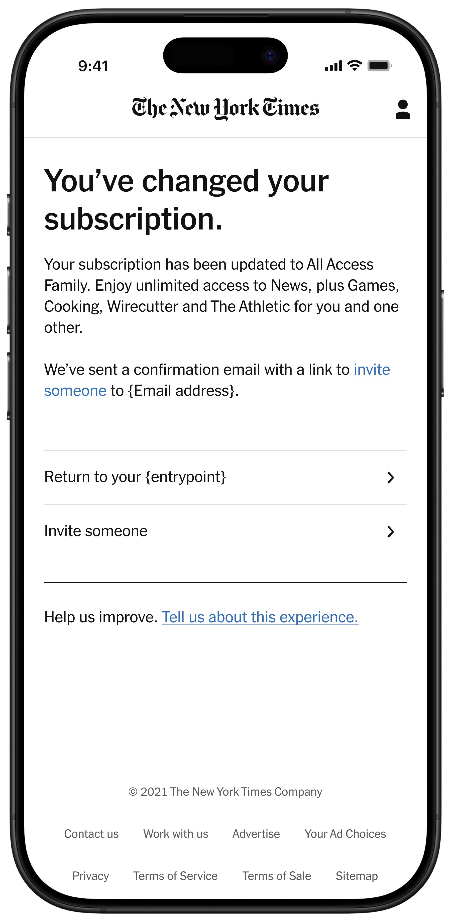
Creating an MVP design that could be used to quickly test the appeal different subscription offerings. The design used primarily existing functionality to move as quickly as possible.
Purchasing a Family Subscription
Using existing Product Switch feature (the way users currently change/upgrade their subscriptions) to present new subscription offerings and evaluate user interest.
managing a family subscription
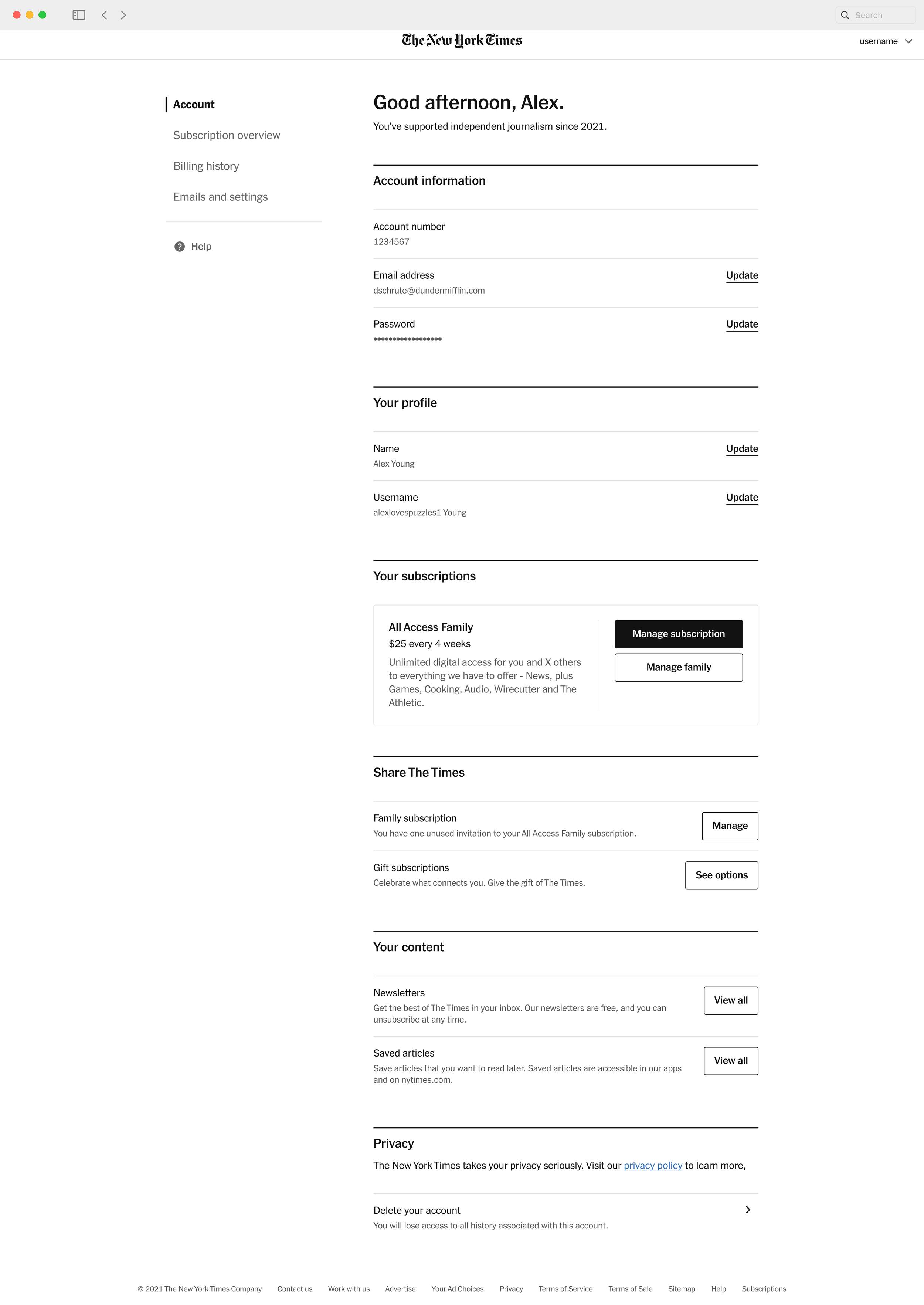
Using existing “bonus subscription” feature and NYT Account design patterns to present to create required sharing functionality with minimal engineering lift.
A/B Testing
Goal:
Using an MVP design, determine how much overall interest users have in family subscriptions, which offering type users engage with, and evaluable usability based general behavioral metrics like clickthrough rate and overall conversion rate.
test results and analysis
There was a statistically significant conversion increase in variant 1 (2 seat) and variant 4 (6 seat at a 2 seat price) over variant 2 (6 seat). However, variant 3 (choice of 2 or 6 seat) preformed slightly stronger than all variants, although without a statistically significant difference between variant 1 (2 seat) and variant 4 (6 seat at a 2 seat price).
next steps:
The Subscription Revenue team decided to move forward with a lower priced, 6 seat offering hypothesizing that this would appeal to users who were interested in both 2 and 6 seat variants, without deterring users who were drawn to the lower price of the 2 seat option.
Phase 2 Iteration
background
After a successful test to validate demand for a family subscription, the Subscriber Revenue team sought to launch an additional test that would:
Improve the usability and iterate on the limited MVP launched for manage a family subscription
Introduce family subscription focused messaging units to inform users about the new upgrade option
design process
Collaborating with marketing creative
Subscriber Revenue collaborated with the marketing creative teams to introduce new upgrade assets (a landing page, a “post login offer,” and a messaging dock that appears on news articles) to introduce family subscription offers to subscribers.
My role as the Subscriber Revenue designer was to clearly define our needs around content and visual assets to marketing creative, provide feedback, and oversee implementation of the designs.
Analyzing existing upgrade messaging surfaces and defining content needs for collaborating with marketing creative team.
Marketing creative assets
After providing content needs and templates to marketing creative team members. They provided us concepts with copy and imagery for feedback and then implementation.
subscription management design enhancements
Improving family subscription management
Due to the limited scope of the initial MVP, several proposed enhancements were deemed out of scope.
Design hypotheses:
Including a family subscription page in the account navigation hierarchy. increasing entry points and a focus on the recipients’ email in the recipients list will make management easier and increase the number of users who share subscriptions.
Evaluating Designs
Usability Testing
In collaboration with user research staff, a usability study was conducted to evaluate:
How users make decisions about purchasing a family subscription
How easily users can complete a family subscription purchase and share access to their subscription
Methodology
6 users were presented with three provocations and asked to complete relevant tasks:
Purchasing a family subscription
Sharing a family subscription
An envisioned future state with enhanced personalization
Envisioned Family Experience
Example of user behavior data in the family management experience to evaluate interest in these features for future planning.
Key Findings
Messaging that emphasized personalization was impactful
Users emphasized the financial value of a family subscription when making a purchase decision
Users were generally able to complete purchasing and management tasks without issue
Users expressed that they would not know everyone they want to share the subscription with immediately, and would have to coordinate with others prior to sharing
Users were interested in seeing “engagement data” about family share recipients, and would like to see information about it prior to purchase
Next steps:
The results from the usability test validated the approaches to the improving the subscription management experience and the value messaging featured in upgrade assets. This allowed the team to move forward with an updated test launch to evaluate the impact of these enhancements.
test launch
Goal:
Test the impact of new user upgrade messaging and improvements to subscription management flow on conversion and on the ability of users to share access to their subscription.
Test results
The test resulted in a significant increase new family subscription users demonstrating strong performance. However, the average number of invitations redeemed was lower than anticipated indicating more work should be done to make the sharing process simpler and encourage users to engage with their subscription benefits.
Designs
Future Refinement (in progress)
After initial launch, work began to evaluate what next steps should be taken to iterate on the family subscription offering.
Family subscription brainstorm
Goal:
Create team alignment on existing problems with family subscriptions, and prioritize how to address them
Methodology:
Design, engineering, product, and research/data met to review research informed user journeys, discuss paint points, solutions and align on strategy
family subscription next steps
Pain Point Identification:
After synthesizing team feedback, I noted 2 clear pain points:
The current invitation process is overly rigid in how a user shares invitations and decreases the likelihood that users will use many of their invitations.
Users must have or create an account that meets specific criteria to successfully redeem their subscription which may limit the number of redeemed invitations.
Next Steps:
I drafted three prioritized areas of focus that will be used to inform 2025 roadmap:
How might we introduce more flexibility to the invitation process to increase the likelihood that users will be able to send more invitations, earlier in the subscription process, and encounter less errors?
How might we continue to engage users after they purchase a family subscription to demonstrate the value of their subscription?
How might we improve the error and edge case handling in the redemption experience to increase the number of users who can successfully redeem a subscription (or are directed on an alternate, appropriate path)?


