Accounts Payable Workflow Tool
overview
The Accounts Payable Workflow (APW) Tool is used to access invoices by the Accounts Payable team. Users can use multiple criteria to search for invoices and can then download an invoice file. Users are typically trying to confirm information or resolve issues on invoice for other employees.
problem
The APW team was seeking design assistance to redesign the tool in order to improve the overall UX and better integrate with the Carbon Design System.
My Role
I worked as a UX Designer and User Researcher in collaboration with a Visual Designer and the development team.
Background research
heuristic review
I completed a Heuristic Review using Nelson Norman Group’s heuristics guide to identify issues with the existing tool’s design.
User interviews
Methods
3 users
30 minute user interviews
Goal was to get a sense of how users are currently using the APW tool and identifying their needs
Key Results
3 users stated they have very little variety in their searches and often use the same attributes
3 users reported only a few results with each search, and they do not spend much time sifting through results
3 users reported their main task to be viewing or downloading invoice images
3 users reported overall satisfaction with the tool
As-Is Scenario
I produced an As-Is scenario to understand how users are currently using the tool and what their needs are
User needs
As a user searching for an invoice, I need a way to quickly select the criteria I'm looking for, so that I don't get slowed down by too many unfamiliar options
As a user trying to examine an invoice, I need a way to view and reference the image of the invoice so I can find and record relevant pieces.
As a user working with large amounts of invoices, I need a way to perform some bulk actions, so I can quickly make changes or notes on many invoices
Tool Analytics
Methods
We used analytics on the APW tool to see how users were interacting with the current tool
Key Results
85% of users were using only one search attribute
Analysis of which attributes were being used in searches
The graph on the left shows a the percentage of searches that have 1, 2, 3 attributes (more than 3 was <1%), and the graph on the right shows the most popular search attributes based on total searches.
Design work
Low fidelity white board work
I went through several rounds of white boarding design solutions to simplify the existing tool and keep the designs consistent with Carbon Design System
high fidelity designs
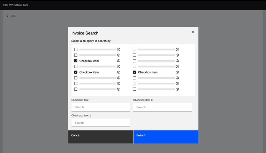
I completed higher fidelity design work to identify how best to simplify the search experience. I used dropdowns to allow access to the most popular search terms, and gave the user access to a modal that would feature search functionality for lesser used attributes.
Users would click into an invoice listing to view the image of the invoice and the attributes fields. Users typically needed both of these views for tasks so it made sense to place them on the same screen. Users also had access to a note log, and actions such as sharing a link and downloading on this page.
User Testing
High fidelity designs were tested with users.
Methods
2 users
Access to users was limited so we were only able to recruit 2 participants
30 minute tests
Users interacted with prototypes and completed key tasks
Key Results
Both users successfully used search for popular and lesser used terms
Both users successfully found the note log after clicking to view an invoice
1 user took a few extra seconds to find the view option, but was able to access it after reading instructions in the subtitle
Both users accessed invoice attributes
Both users successfully completed all tasks
visual design updates and final design
I worked with a visual designer to further simplify the design proposal and update visual features
visual design updates
Dropdown menus were expanded to have all attributes in them, but were broken into sections based on usage
Advanced search features like larger data inputs or searches with many attributes could now be made in a side panel


